
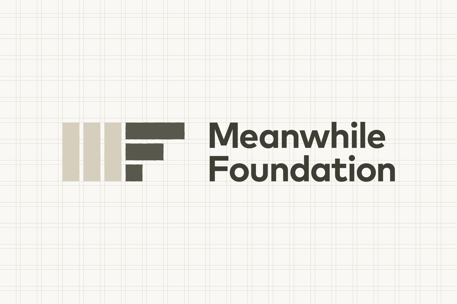
Meanwhile Foundation
Building an adaptable identity

Challenge
Vacant properties have a negative impact on our neighbourhoods. Meanwhile Foundation turn empty spaces into opportunities to create social and economic value. They achieve this by becoming tenants and enabling people to make use of disused offices, railway arches, and shops.
Meanwhile Foundation asked us to create a new logo for their organisation, and six graphics for their website that could aid content navigation. The aesthetic had to convey meanwhile use objectives and communicate the role of good design in placemaking.

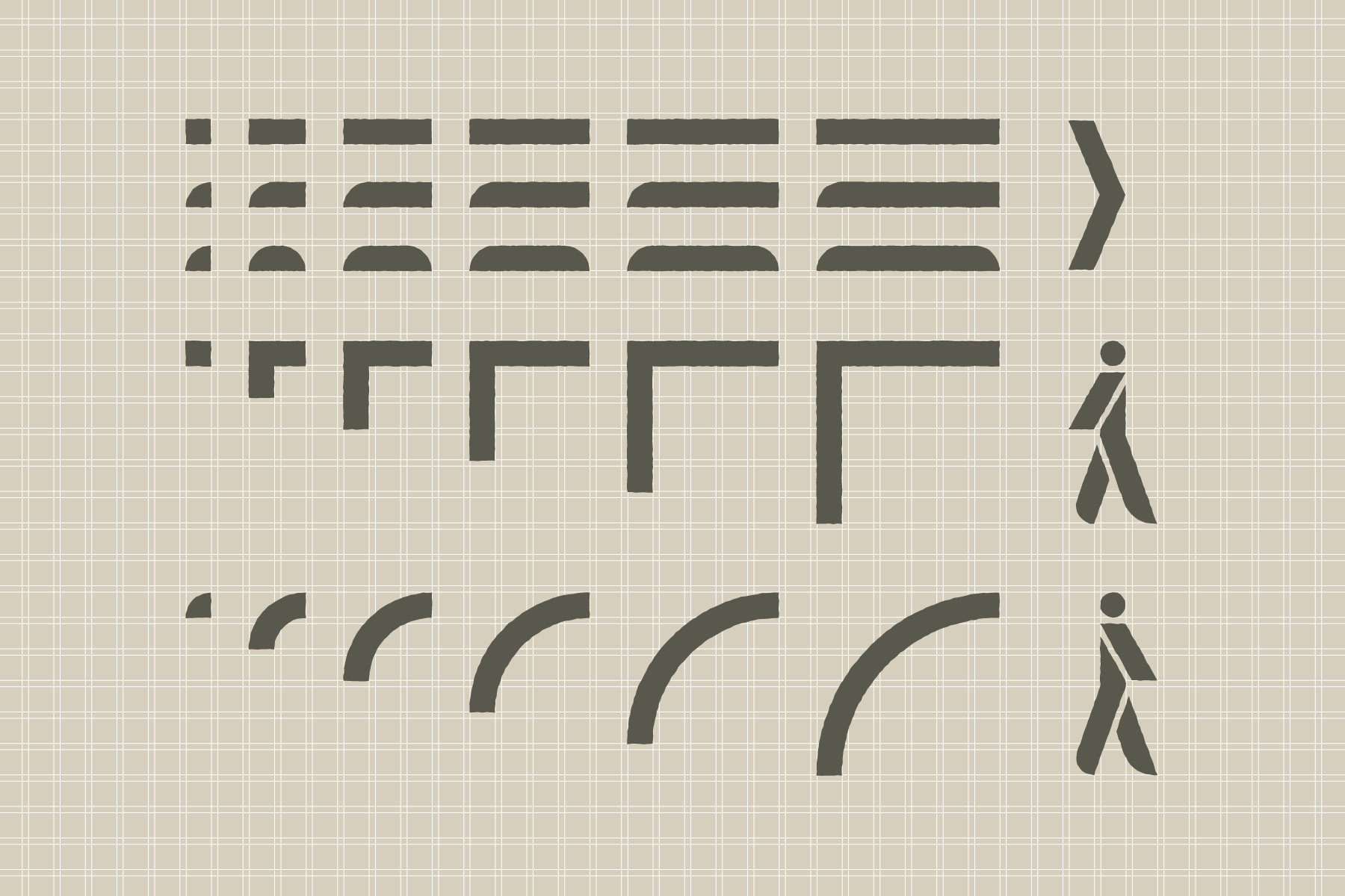
Solution
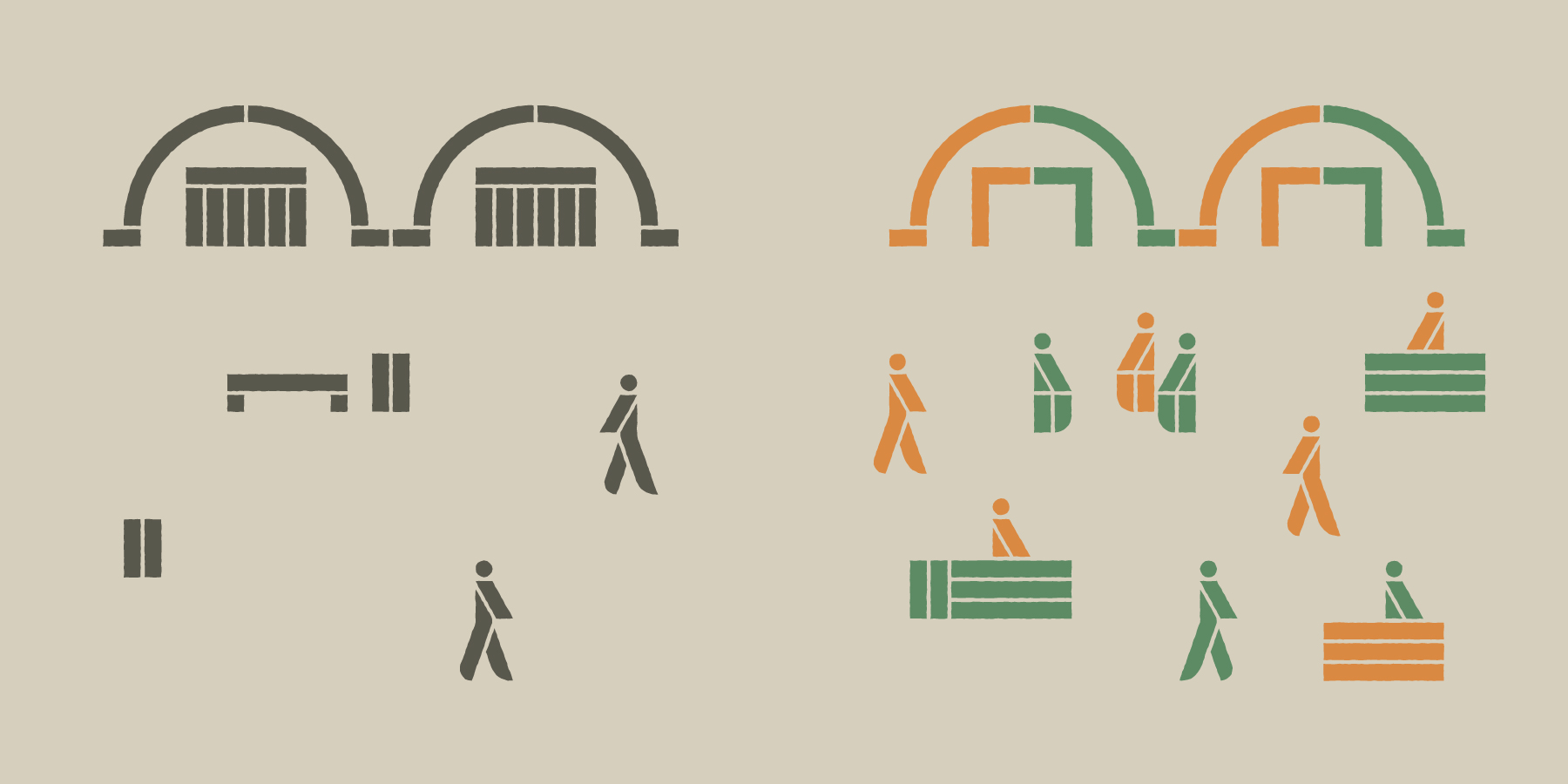
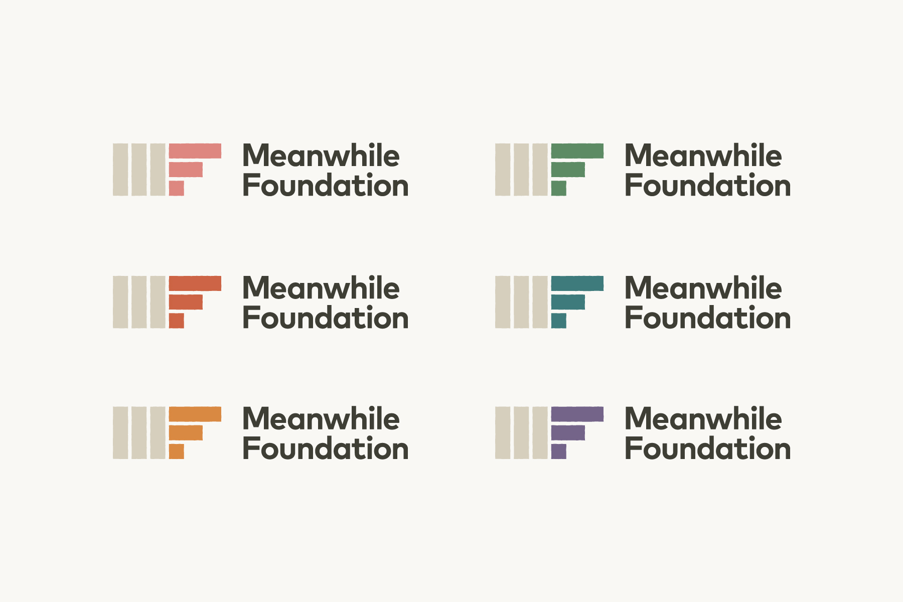
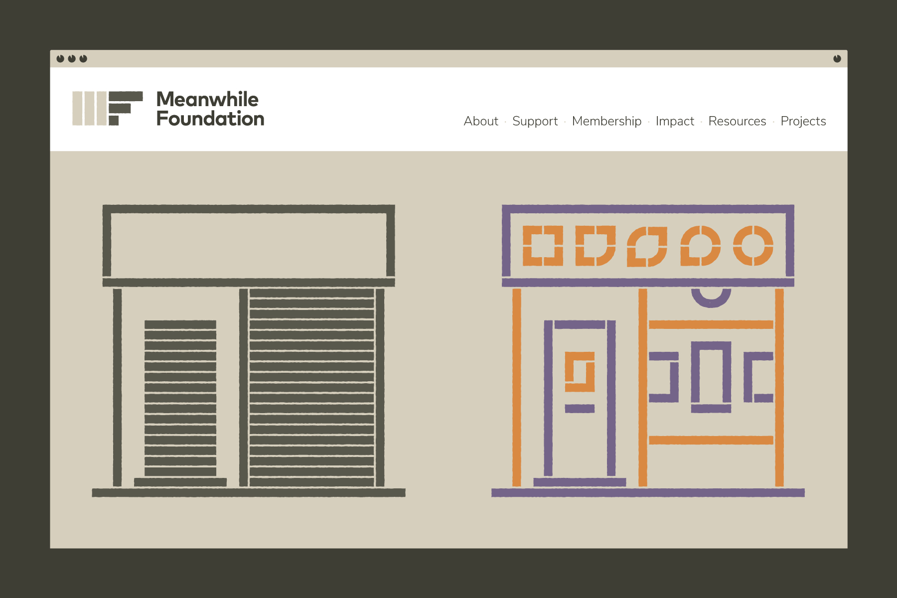
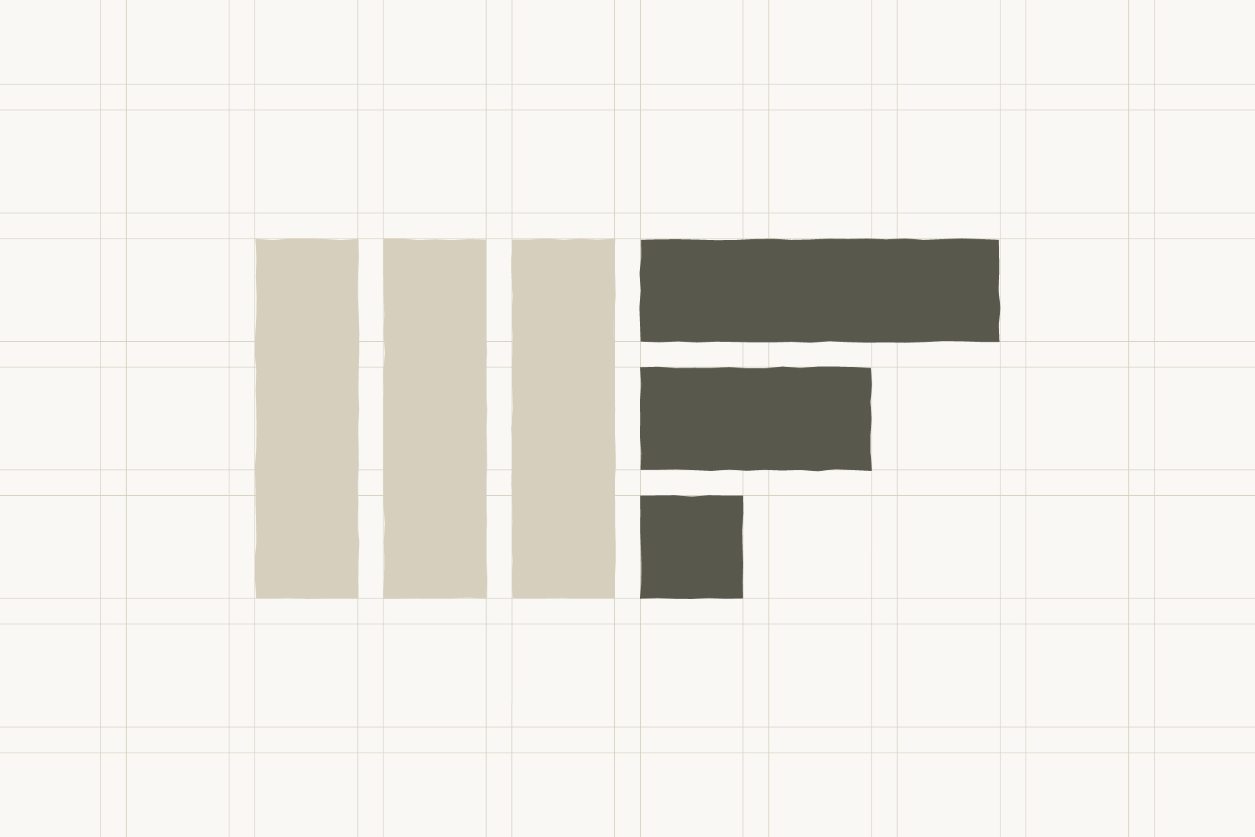
Our concept is based on building blocks that connect inside a grid to create new structures. This simple method provides Meanwhile Foundation with the means to make consistent illustrations on demand. We used the same grid system to create the Meanwhile Foundation logo. Six blocks form an abstract monogram representing structure and shared space.
We created place marker pictograms to introduce each page on the Meanwhile Foundation website. Our illustrations are divided in two. Monotones represent unused space and unordered information. Colour symbolises repurposed space and meaningful data.
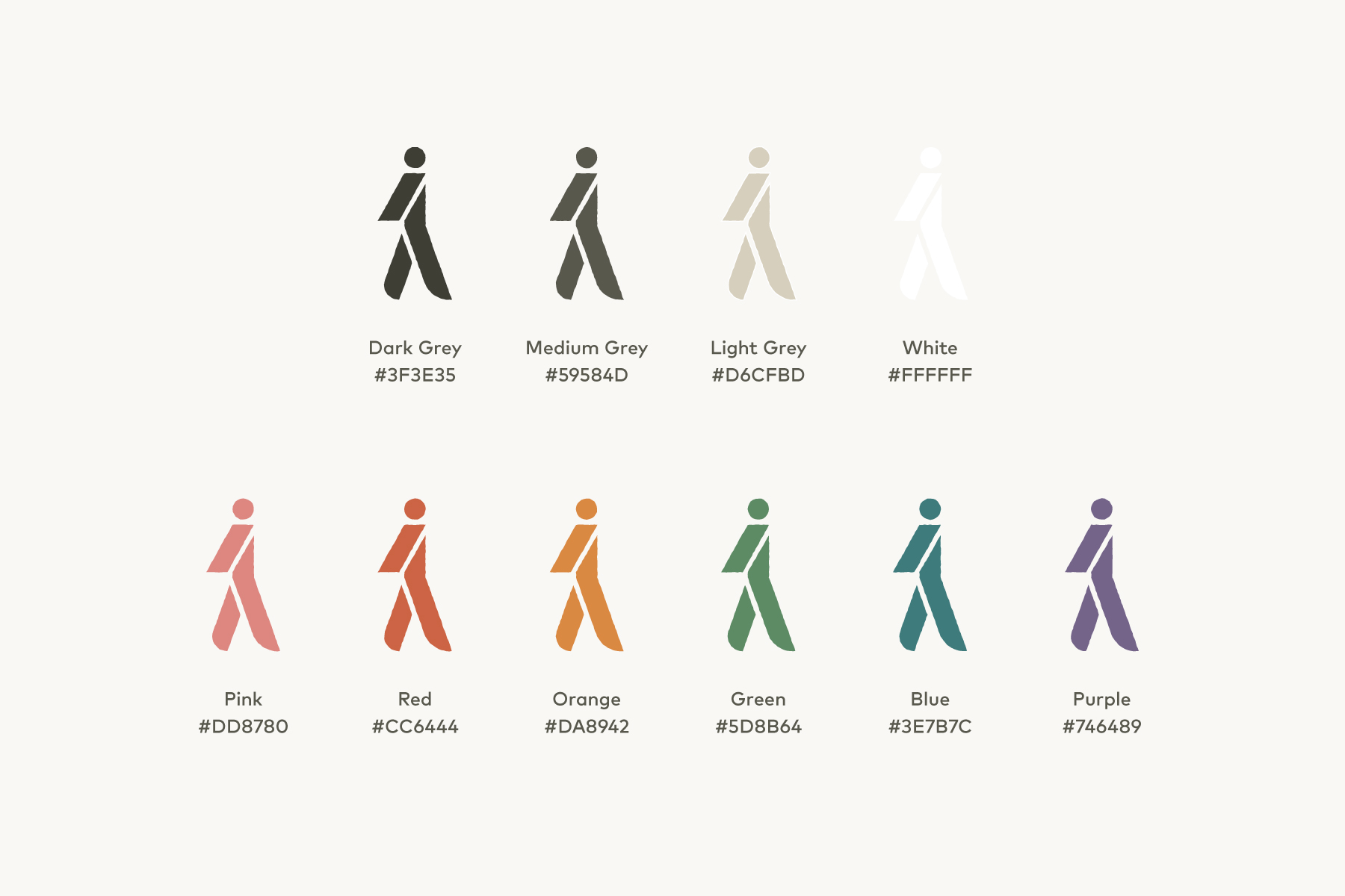
Meanwhile Foundation received a graphic design toolkit containing all of the project outcomes required to create new communications: colour palettes, open source font files, logotype, monograms, social media avatars, and original illustrative assets.
“The project looks charming, professional, and serious. The colour palette and style are great.”
Jessica Tsang
Projects Director
Meanwhile Space CIC