
Why ‘Minute Works’?
Category: Studio
Deciding on a name for your studio is a hard task. In this post—from 2014 and last updated in 2019—we talk about why we chose Minute Works.
Update
It’s been five years since we established Minute Works as an independent graphic design studio. Back in 2014 we based our logo on an hourglass. The object caught our attention due to its ability to convey an urgent need for positive change.
Here we are in 2019 and the hourglass (not our hourglass) has become a global symbol of climate change activism. That’s an amazing coincidence! The Extinction Symbol was created way back in 2011. It came to prominence when Extinction Rebellion adopted it. For a while its origins were unknown.
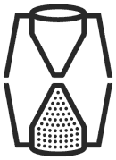
We still love our hourglass. Fashioned from the letters ‘M’ and ‘W’, it contains 60 dots. 55 appear in the lower-half and five are positioned in the top. Read on to learn more about what they mean.
2014
Before we chose a name for our studio we took a moment to re-read books that informed our practice. In The Medium is the Message McLuhan and Fiore wrote:
“All media work us over completely. They are so pervasive in their personal, political, economic, aesthetic, psychological, moral, ethical and social consequences that they leave no part of us untouched, unaffected, unaltered … Any understanding of social and cultural change is impossible without a knowledge of the way media work as environments.”
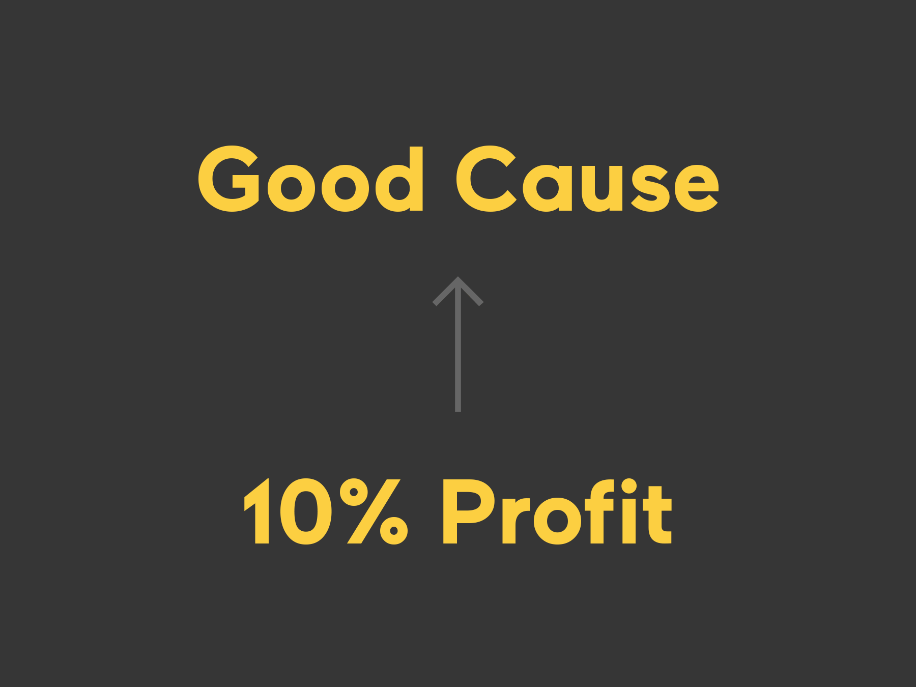
This statement helped us to define what we stand for and how we relate our work to the world we live in. We are interested in graphic design’s ability to create change. We aim to devote our time to meaningful ideas that encourage community, democracy, and sustainability.
With this clear sense of purpose in mind we started to consider how the notion of ‘time devoted to design for change’ might be symbolised. How have calls for social change been visualised in the past? One example is the Doomsday Clock, which the Bulletin of Atomic Scientists describe as:
“… a design that warns the public about how close we are to destroying our world with dangerous technologies of our own making. It is a metaphor, a reminder of the perils we must address if we are to survive on the planet.”
In 2007 the Bulletin of the Atomic Scientists added climate change to the list of concerns that affect the Clock’s setting. We wanted our name to communicate a counteractive response to this issue. Our practice is one part of an international attempt to set the Clock back from midnight.
We decided to create a studio identity that would denote making time against the odds. One challenge would be avoiding established icons like the Clock, based on traditional faces. Instead we looked at other devices used to measure time.
Our logo was inspired by an hourglass; an object that uses natural materials to convey the passing of seconds, minutes, and hours. The letters ‘M’ and ‘W’ have been loosely shaped into a frame. We’ve placed 60 dots inside the glass. 55 appear in the lower-half. Five are positioned in the top. Their placement acknowledges the Clock’s current setting at 11:55. Since an hourglass has to be rotated, it represents change and renewal.
The Minute Works logotype is based on Brandon Grotesque. The dot above the letter ‘i’ has been redrawn to include a second subtle reference to 11:55. Our colour palette is influenced by Martyl Langsdorf’s cover designs for the Bulletin for Atomic Scientists.